An animated Webflow site usually starts with a simple request: “Make it feel alive.” The first real decision shows up a few minutes later, when you pick your motion stack. Do you stay inside webflow interactions (component states, hover and focus transitions), or do you bring in custom code as soon as the storyboard gets ambitious?
It sounds like the motion request arrives late: the Figma prototype looks finished, then the Webflow build gets a new checklist, and the interactions panel starts filling with experiments. Would it be a bad idea to budget motion before you touch anything? That budget keeps a single hero animation from turning into a week of debugging.
This case study is a reference build. It uses common constraints and a measurement plan instead of client-specific numbers. The value promise is decision utility: you should be able to copy the approach into a real project, ship quickly, and keep motion from turning into rework.
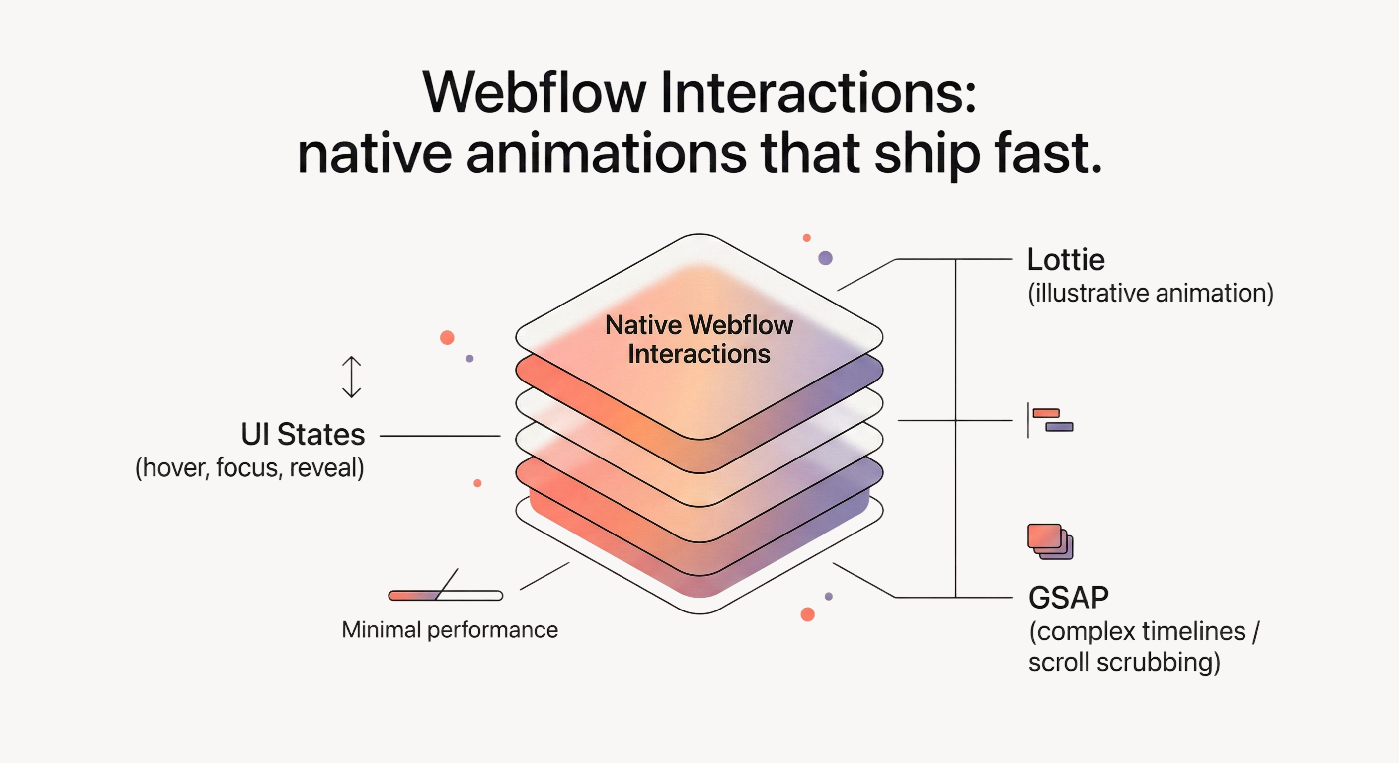
Most marketing sites can stay native and still look polished. Native Webflow Interactions cover section reveals, hover and focus feedback, lightweight scroll effects, and a few hero moments that carry the story. Lottie earns its place when the motion is self-contained and primarily illustrative. Custom code (GSAP) becomes the safer path when you need complex timelines, scroll-scrubbing, page transitions, or strict motion consistency across many pages.
We wanted motion that felt intentional, and we needed it to stay that way after the handoff. It looks like a hover animation is the risk until the hero stutters on a phone, a scroll effect behaves differently in Safari, or the interaction list becomes so tangled that nobody wants to touch it.
The decision was a governance choice: keep motion shippable inside Webflow, with patterns the team could reuse and clean up, or accept a small JavaScript surface area and the ownership that comes with it.
We started with a native-first rule for anything that looks like a UI state: - hover and focus feedback - menu open and close transitions - section reveals that do not scrub to scroll position - small emphasis on CTAs that stays subtle
Then we defined an exit ramp before building a single interaction. If a specific section required scroll-scrubbing, timeline-level sequencing across many elements, or easing control that made the visual editor fight us, that section could move to Lottie or GSAP. The guardrail was scope: one section, one page, one reason.
Because this is a reference build, think in constraints, not in client anecdotes. These are the constraints that shape motion work in Webflow even when the design looks “simple”:
Those constraints point to one practical conclusion: “fast” requires budgets. Without budgets, you ship motion quickly, then you spend the next sprint trying to explain why the page feels heavy.
This may sound like extra process for a marketing page. The trade is straightforward: a few minutes up front buys you fewer performance surprises and a clearer rollback path when something “breaks unexplainably” in the first screen.
Here is the reference budget we use in this build, written as targets plus triggers:
For this reference build, we use standard Core Web Vitals thresholds as the top-line targets, and we treat regressions as triggers to simplify animation on the first screen. See Google’s definition and evaluation model (75th percentile in the field): Core Web Vitals thresholds.
For runtime smoothness, a 60fps scroll experience leaves roughly 16ms per frame. When scroll-linked motion causes long frames, the fix usually starts with reducing layout and paint work.
A cap on total interactions forces reuse and keeps the dependency graph understandable. Class-based triggers plus a small reusable pattern kit do most of the work.
Reduced motion needs a behavior change, not a token note. prefers-reduced-motion is the baseline mechanism: prefers-reduced-motion.
Reference rule: under reduced motion, disable scroll-scrub effects and parallax entirely, and fall back to instant states or minimal fades.
Once budgets exist, the animation plan becomes a sorting task. You decide what motion is doing for the reader, then you spend the budget on the highest leverage moments.
We use a three-layer plan:
1) Structure motion (helps the reader scan). Section reveals, subtle stagger on card grids, “this is clickable” hover and focus feedback. This is where webflow interactions examples work well, because a single interaction pattern can be reused across the whole site with one class.
2) Narrative motion (sells one idea). One or two hero moments aligned to the page’s message. This is where teams overspend. The rule is explicit: pick one message-bearing moment per page, then keep the rest quiet.
3) Decorative motion (adds flavor, carries no meaning). Decorative motion must be cheap to remove. This is where webflow lottie often fits, as long as it is treated like an asset with a size budget and a playback plan.
Keep text and forms stable so motion reads as intentional instead of distracting.
Speed comes from reuse. If you want a webflow interactions tutorial mindset that transfers to real projects, start by building a small system first, then apply it everywhere instead of inventing a new interaction for every section.
Adopt a naming convention that survives a future cleanup: - ix - reveal - fade-up - ix - hover - button - ix - nav - open-close
Searchability under pressure matters more than aesthetics, so prioritize clarity over clever names.
Start with a small kit: - a reveal interaction (fade + small translate) - a hover and focus interaction for buttons and cards - a menu open and close transition - a “section in view” interaction for subtle emphasis
Apply the kit through classes. If one section needs a slightly different distance or duration, treat that as a decision. Either promote the new version into the kit, or keep the exception rare and justified.
Scroll-linked motion is where “native is fast” turns into “native is fragile.” Keep it constrained: - animate transform and opacity only - limit the number of elements moving at the same time - avoid pairing heavy embeds or videos with scroll-linked effects in the same viewport
If you need a true webflow scroll animation that scrubs to scroll position, treat that as an exit-ramp candidate. It often belongs in GSAP or in a simplified design.
When you use Lottie, plan playback. If an animation autoplays below the fold, users do not see it. In practice, that means you either loop subtly or you trigger playback on scroll into view, then you test on mobile where decoding and scrolling can interact in surprising ways.
In most cases, the safest baseline is to animate transform and opacity, and treat layout and paint-heavy animation as a last resort.
In Webflow terms, prefer moving and fading elements, avoid animating width and height on content-heavy blocks, and treat blur and heavy filters as high-cost - especially during scroll.
If the Webflow Designer feels slow, assets can be the cause as much as interactions. Large SVGs and complex vector paths can make scrolling and editing feel laggy inside animated sections, so compress and simplify them and keep the hero light if it animates on load.
Before launch, record one repeatable scroll path in Chrome DevTools Performance and look for long frames and long tasks that line up with scroll-linked effects.
When you find a hotspot, simplify before you micro-optimize. Remove filters, reduce the number of simultaneous moving elements, and convert layout-affecting motion into transform-based motion where possible.
Reduced motion is a behavior change, so the page should remain readable and usable when motion is reduced.
Practical reduced-motion plan: disable scroll-scrub and parallax effects, shorten or remove reveals on long pages (instant state is acceptable), keep focus states visible and stable, and avoid autoplay loops that draw attention indefinitely.
In Webflow, reduced-motion support usually takes a small CSS snippet in custom code. Keep it narrow, then QA it.
The goal is to catch the failure patterns that show up in animation-heavy Webflow projects: device variance, scroll capture, and interaction entropy.
Pre-launch checks: - Device matrix: at least one mid-tier phone, plus Safari and Chrome on desktop. Scroll the same path and watch for stutter. - Core Web Vitals smoke test: run a lab pass and look for regressions on the first screen. If LCP worsens after adding motion, simplify above the fold first. - Reduced motion: confirm the page is readable and usable when motion is reduced. If reduced motion is broken, treat that as a blocker. - Embed scroll capture: move the cursor over videos and embeds while scrolling. If scroll gets hijacked, change embed settings or move the embed out of scroll-linked sections. - Interaction cleanup: remove unused interactions and confirm the interaction list matches the current site.
After the checklist, do one “break it on purpose” pass. Disable or delete a single interaction that touches the hero and confirm the page still loads and reads. That is how you keep rollback real.
Native Webflow Interactions are a strong default. They stop being the fastest safe path when the motion requires timeline-level control, scrubbing, or cross-page consistency that the visual editor makes tedious.
Would it be a bad idea to keep code scoped to one page until you have proven it pays off? That constraint keeps an “animated site” from quietly turning into a JavaScript project.
Use Lottie when the motion is primarily illustrative and self-contained: - icon loops - small explainer moments inside a hero
Keep Lottie for illustration, and keep UI states inside webflow interactions.
Move a section to code when one of these triggers happens: - you need scroll-scrubbing and the native setup becomes fragile across devices - you need complex timelines and sequencing that drive interaction count growth, and workarounds start piling up - you need the same motion system reused across many pages with strict consistency
If you adopt webflow gsap interactions, treat it as version-sensitive and confirm it fits your collaboration constraints. Webflow documents current behavior and limitations here: Intro to Interactions with GSAP.
If you add custom GSAP code, keep it scoped. Treat “sitewide code” as a deliberate choice, and prefer per-page loading when only one or two pages need it.
Most animation rework comes from the same three mistakes: budgets are decided late, scroll effects are added before the mobile path is tested, and interactions are named like disposable experiments. Next time we would lock the budget earlier, test the mobile scroll path first, keep the interaction kit small enough to reuse, and treat embeds as a high-risk dependency in any scroll-linked section.
If you want to apply this quickly, start on one page: - pick one page (usually the homepage) and write a motion budget - build a tiny interaction kit and apply it sitewide before adding one-offs - test the scroll path on a real phone and remove the first “fun” animation that costs you smoothness
Once the kit behaves on mobile, reuse it across pages and do a cleanup pass before launch.
If you want help shipping this in Webflow, start with Webflow implementation and bring one page you want animated first.
It took the Managed Code team five months to build the application, as initially planned. The app that Managed Code developed runs smoothly, is highly rated by users, and helps the client generate a steady profit. The team was highly communicative, and internal stakeholders were particularly impressed with Managed Code's expertise.

Their professionalism and commitment to delivering high-quality solutions made the collaboration highly successful.
Thanks to Managed Code's efforts, the AI assistant significantly improved the client's ability to serve new and existing clients, resulting in increased customer satisfaction and higher sales. The team was responsive, adaptable, and committed to excellence, ensuring a successful collaboration
We're impressed by their expertise and their client-focused work.
With an excellent workflow and transparent communication on Google Meet, email, and WhatsApp, Managed Code delivered just what the client wanted. They effortlessly focused on the client's needs by being client focused, as well.